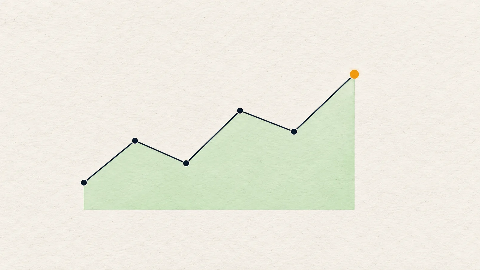
Reading a crypto chart means turning price history into a map of conditions: which way the market has been moving, where it has reacted before, where orders are likely resting, and which price would prove a view wrong. A dependable read follows a fixed order, from the largest timeframe down to the trigger, and ends in a plan rather than a forecast.
What does it mean to read a chart?
Most beginners open a chart and look for the next move. That is the wrong question, and it is why the same chart can feel bullish at breakfast and bearish after lunch. A better question is: what is the market doing, what would change that, and what do I do in each case?
A read has three outputs:
- Context: trend and structure on the timeframes that matter.
- Map: levels, liquidity and zones where price is likely to react.
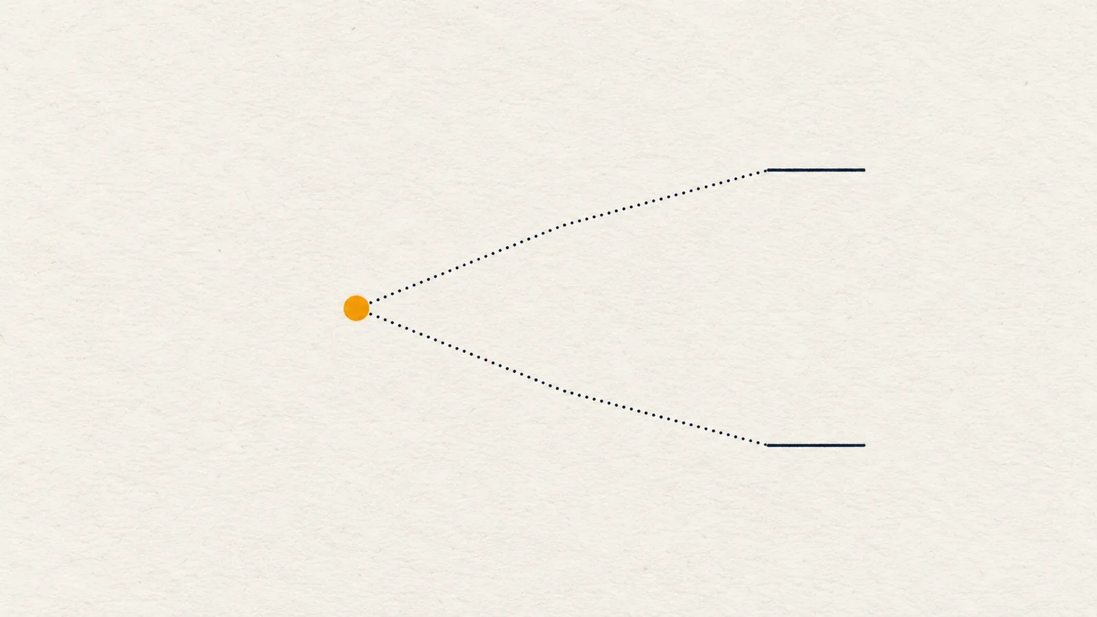
- Plan: two or three conditional paths ("if price closes above X, then..."), plus one price that cancels the idea.
You do not need to predict anything to produce those three. You need a repeatable order, and the discipline to stop when the chart does not offer a clear answer.
The reading order at a glance
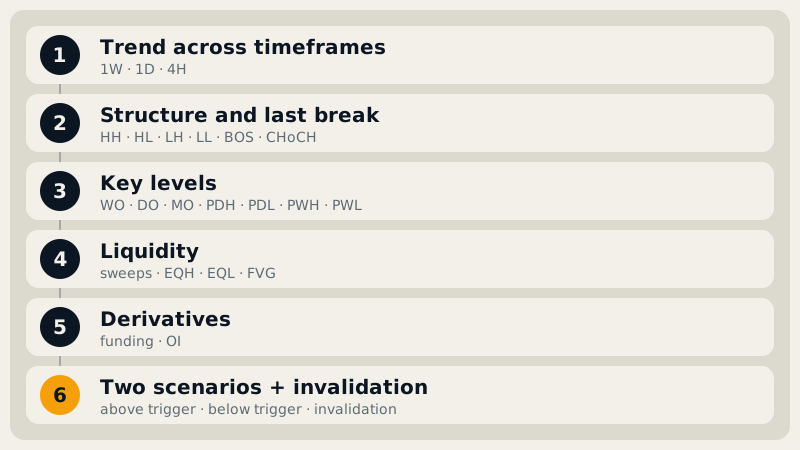
The order is: timeframe, structure, levels, liquidity, zones, derivatives, plan. Each step narrows the one before it. Skip ahead and you end up drawing a beautiful zone on a chart whose bigger picture says the opposite.
Step 1: Which timeframe sets the context?
Pick the timeframe you actually trade, then read one or two above it first. A 4H trader starts with the weekly and daily chart; a daily trader starts with the weekly. The higher timeframes show the direction of the larger flow, and the levels they print are usually respected more than a level from a 15-minute chart.
Ask only two things at this stage: is each timeframe trending up, trending down, or ranging, and do they agree? If the weekly and daily are bullish while the 4H is bearish, you are looking at a pullback inside a larger move, or the beginning of a turn. You do not know which yet, but you now know the question. The full method is in multi-timeframe analysis.
Step 2: What is the structure doing?
Structure is the sequence of swing highs and swing lows. A swing high is a candle with lower highs on both sides of it; a swing low is the mirror. Higher highs plus higher lows (HH/HL) describe an uptrend; lower highs plus lower lows (LH/LL) describe a downtrend; a mix describes a range.
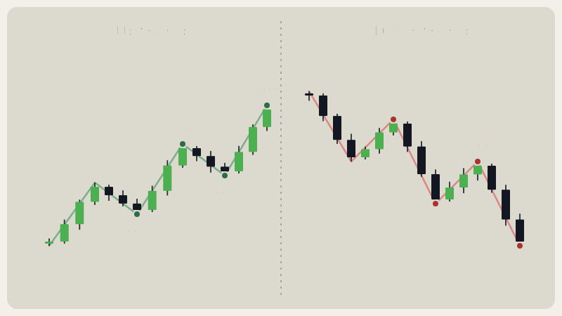
Then look for the most recent break of structure: a candle that closes beyond the last swing point. A break in the direction of the existing trend is a BOS and says the trend is continuing. A break against it is a CHoCH (change of character) and says the old sequence has been challenged. Both are covered in market structure and BOS vs CHoCH.
Two details that save beginners a lot of grief:
- Closes count, wicks do not. A wick through a swing point is information about liquidity (Step 4), not a structure break.
- The swing that carries the trend is your invalidation. In an uptrend it is the last higher low; in a downtrend, the last lower high. Note its price now. You will need it in Step 7.
Step 3: Where are the levels?
Levels are prices where the market has reacted before. Start with the obvious ones: swing highs and lows that were touched several times, because the more a price has mattered, the more attention it draws. Then add the reference prices many traders watch:
- the daily, weekly and monthly opens (DO, WO, MO), which act as "fair price" pivots for the period;
- the previous day's and previous week's high and low (PDH, PDL, PWH, PWL), the nearest places where stops from the last session sit.
Do not draw twenty lines, because a chart with twenty lines supports any story. Mark the three or four closest above price and below price, and let nearby swing points merge into one level instead of drawing a stripe. Our guide on support and resistance shows how a cluster of swings becomes a level, and the same idea applies to the opens and prior highs and lows.
Step 4: Where is the liquidity?
Liquidity is where many orders cluster. Stop-losses sit just beyond obvious highs and lows, and breakout orders sit just beyond obvious levels. Two things to look for:
- Equal highs or equal lows: two swing points at nearly the same price. Stops pile up above or below them, which makes them a magnet.
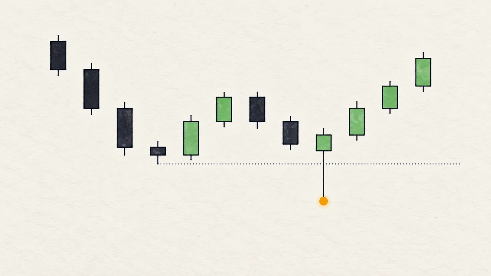
- A liquidity sweep: a wick that pushes beyond a recent swing point and then closes back inside. The wick collected those stops, and the close shows price did not stay out there.
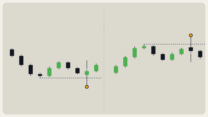
A sweep and a breakout look similar for one candle and mean different things. The difference is the close. A candle body that closes beyond the level is a break; a wick that returns is a sweep. A sweep does not promise a reversal. Sometimes it is the first step of a break. What it gives you is a cleaner place to define risk, as covered in liquidity sweep.
Step 5: Is there a gap or a zone to watch?
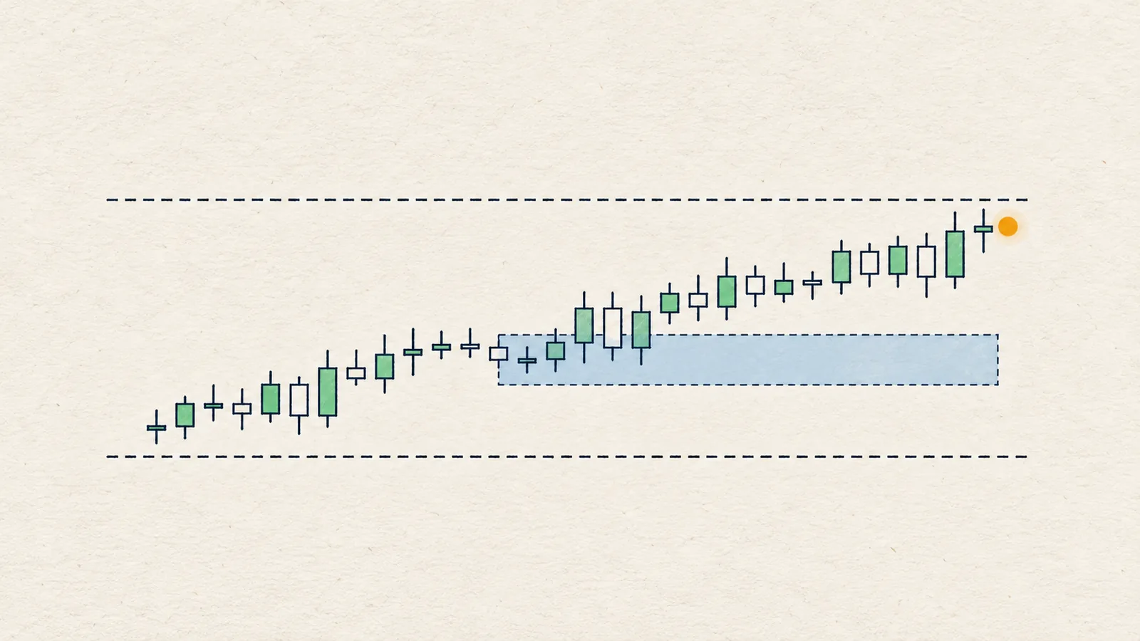
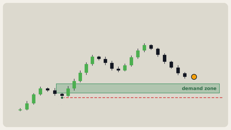
Fast moves leave fair value gaps (FVGs): three-candle patterns where the middle candle moved so quickly that the first candle's high and the third candle's low do not overlap. That empty space is where price often pauses or returns to when it pulls back. Read more in fair value gap.
Combine the gap with the nearest level and you get a zone: the area where you would expect a pullback to react. Then check where price sits inside the larger range. Above the midpoint is premium; below it is discount. Pullbacks into discount fit an uptrend better, pullbacks into premium fit a downtrend better, and the middle is where most of the noise lives.
Step 6: What do derivatives say?
Spot candles show what price did. Futures data shows how traders are positioned while it did it. Three numbers are enough:
- Funding rate: the periodic payment between longs and shorts on perpetual futures. Strongly positive funding means longs are paying to hold; strongly negative means shorts are. See funding rate.
- Open interest (OI): the total value of open futures positions. Rising means positions are being opened; falling means they are being closed. It does not tell you who is opening them.
- Long/short ratio: how many accounts are long versus short. Read it against the coin's own normal, because altcoins typically sit higher than Bitcoin.
Treat this as context for the plan, not as a trigger. A crowded long side makes a flush more plausible, but it is a reason to be careful, not a reason to short.
Step 7: Turn the read into a plan
This is the step beginners skip, and it is the one that makes the other six useful. Write two conditional paths and one cancel level:
- If price closes above A on my timeframe, then the next reference prices are B and C.
- If price closes below D, then the next reference prices are E and F.
- If price closes beyond the protecting swing G, this read is void and I start again.
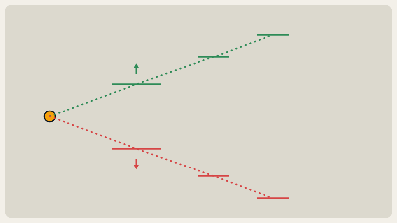
Note what is not in there: a forecast. The plan lists what you will do once the market chooses. Planning this way is covered in trading scenarios and invalidation, and it also explains why "no edge here, wait" is a valid conclusion when price sits mid-range.
Worked example: BNB 1D, 8 Oct 2026
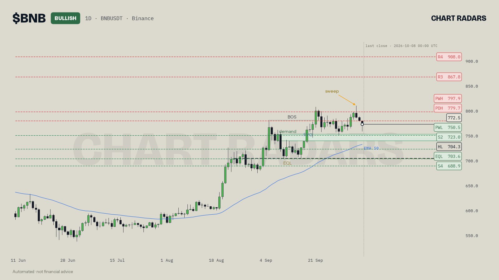
Here is the order applied to the Chart Radars chart of BNB on the daily timeframe (last close 8 Oct 2026, 00:00 UTC, price about 772.5).
- Timeframe. The read has 1D and 1W both bullish, so the larger picture is up. The chart carries a BULLISH label.
- Structure. Highs and lows are HH and HL, and the last structure break was a BOS upward. The last higher low is 704.3. That is the protecting swing, so it becomes the invalidation: a daily close below it voids the read.
- Levels. Price sits right on the monthly open (769.28) and the daily open (772.45), which the read calls a pivot cluster where the market has not picked a side. It is below the weekly open at 795.4. Above, the 779.7 prior-day high and the 797.9 prior-week high are the nearest references, then 867.8 and 908.0.
- Liquidity. A sweep is marked at the top: a wick went above 807.49 and the candle closed back inside. There is also an equal-low level at 703.6, sitting almost on top of the 704.3 higher low.
- Zone. A demand zone with an FVG sits at 739.5 to 752.5. Price is about 39% of the way up its range, which is the discount half.
- Derivatives. Open interest is $444.1M, down 1.4% in 24 hours, so positions are being closed more than opened. Funding is about 0.0000%, takers are at 0.91 and long/short is 2.35. Volume is 0.9 times its recent average.
- Plan. If the daily closes above 779.7, the next references are 797.9, 867.8 and 908.0. If price pulls back into 739.5 to 752.5, that is where a reaction would be expected, and the read wants confirmation on a lower timeframe before acting. A sweep of the local lows is acceptable provided 704.3 holds. If the daily closes below 704.3, the structure is no longer bullish and the read is void.
Notice that the read also flags something awkward: BNB makes higher highs against USDT but not against BTC, which the read treats as a sign the move is tiring. A good read carries its own counter-evidence. Seven steps do not give you a clean story; they give you an honest one.
Worked example: when the answer is "wait"
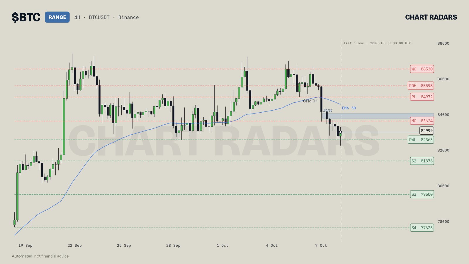
Look at BTC on 4H, close of 8 Oct 2026 (08:00 UTC), price about 82999. The chart label says RANGE. The read says 4H is bearish while 1D and 1W are bullish, so the timeframes disagree, and the bias is neutral. The last structure break is a CHoCH downward. Price sits below the monthly open (83624), weekly open (86530) and daily open (83322), with the prior-week low at 82563 just beneath it.
The read's conclusion: no edge in the middle of the 82563 to 83624 range, so act only at the edges. A long only after a sweep and reclaim of 82563, a short only after a rejection at 83624, and a 4H close beyond either edge ends the range. Funding is slightly negative and open interest is down 1.5% in 24 hours.
That is a complete read even though it contains no trade. Knowing that the middle of a range is not worth your capital is one of the most useful outputs a read can have.
Which steps do beginners rush, and what goes wrong?
Beginners most often start on the lowest timeframe, call a break from a wick, treat derivatives as triggers or skip the cancel level. Each of these has its own fix in chart reading mistakes.
In Chart Radars: the engine measures these steps mechanically, on closed candles only. A swing point needs 3 lower (or higher) candles on each side. The trend read needs three things at once: HH+HL or LH+LL structure, a close at least 0.3 ATR from the 50 EMA, and an EMA slope in the same direction over the last 10 candles; otherwise it says range. The label in the chart header is the overall bias across timeframes, and RANGE there means neutral. ATR is the average candle size over 14 candles, and every distance is measured in ATR so coins compare fairly. Swing points within 0.6 ATR merge into one level. A sweep is a wick past a swing from the last 40 candles, within the last 3 candles, that closes back inside; equal highs or lows are two swings within 0.15 ATR. An FVG must be at least 0.25 ATR wide. Funding above 0.03% means longs clearly pay; below -0.01%, shorts pay; open interest moves beyond 1% count as opening or closing. The invalidation is the nearest carrying swing, 1 to 6 ATR from entry.
Honest note: following the order does not make the outcome predictable. Chart Radars' own back-testing found that the trend label on its own showed no strong directional edge, which is why the read is a map of conditions with an if/then plan rather than a forecast. The method protects you from skipping steps and from hindsight stories. It does not remove uncertainty.
Key takeaways
- A chart read produces context, a map and a plan, not a prediction.
- Use the order: timeframe, structure, levels, liquidity, zones, derivatives, plan.
- Closes confirm structure; wicks tell you about liquidity.
- The carrying swing is your invalidation, so note it in step 2 and use it in step 7.
- If the middle of a range offers no edge, "wait for the edges" is a correct conclusion.
Frequently asked questions
How do I read a crypto chart as a beginner?
Use a fixed order: start on a higher timeframe for the big picture, read the swing structure, mark the nearby levels, note where stops may be resting, then write an if/then plan with a price that proves you wrong. The order matters more than any single tool.
Which timeframe should I use to read crypto charts?
Start one or two steps above the timeframe you trade. If you trade the 4H chart, read the daily and weekly first, because they set the context the 4H candles move in. Then drop to your own timeframe for levels and triggers.
What is the most important thing on a crypto chart?
No single item wins, but price structure (the sequence of swing highs and lows) is the backbone. Levels, liquidity and indicators only make sense relative to it, and the swing that would break it is usually where your plan is invalidated.
Do I need indicators to read a crypto chart?
Not to start. Structure, levels and candle closes carry most of the information. A moving average such as the 50 EMA, volume and derivatives data are useful context, but they confirm or question a read; they should not be the read.
Can a chart tell me where price will go?
No. A chart shows where price has reacted, where orders probably wait and which levels would change the picture. That lets you plan for both directions and define invalidation, which is more reliable than predicting.