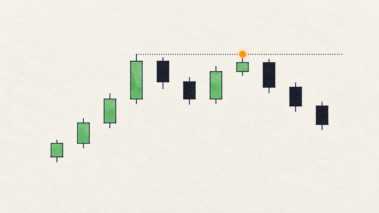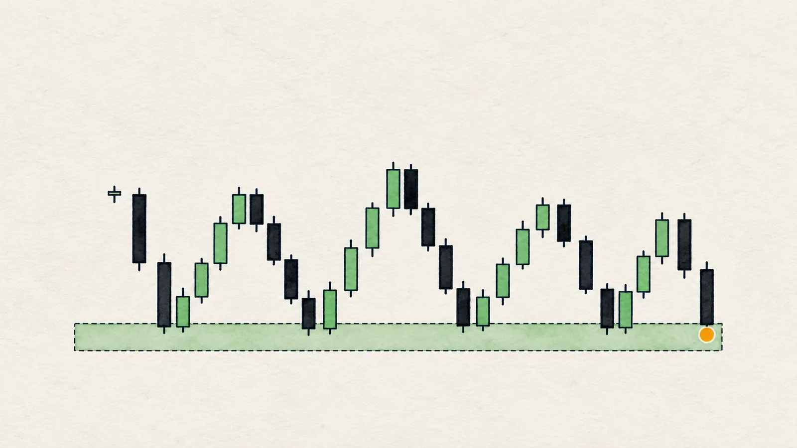
Support and resistance are price zones where buying or selling interest has previously been strong enough to stop or reverse a move. Support sits below the current price and resistance sits above it. On a chart they appear as areas where several swing highs or swing lows landed at nearly the same price.
Most beginners draw too many lines, and every line is exact to the cent. That is the first thing to fix. A chart with fifteen horizontal lines explains everything after the fact and helps with nothing before it. This guide goes the other way: fewer levels, drawn as zones, each one backed by a reason you can state in one sentence.
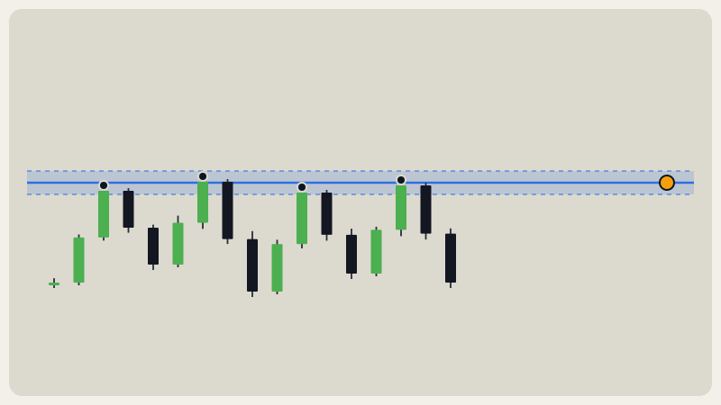
What are support and resistance, really?
Think of a level as a place where orders were left. Say price fell to 100 and bounced. Some buyers got filled and others did not. The ones who missed the entry remember it: "I would buy there next time." Traders who bought and are now underwater may decide to exit at breakeven. Stop orders from shorts sit just above. All of that is unfinished business at roughly the same price, which is why price so often pauses there again.
That is also why a level is a zone and not a line. Orders are spread over a range, wicks poke through, and different venues print slightly different highs. A single line implies precision the market does not have.
How do you draw a support or resistance zone step by step?
- Start on a higher timeframe. Open the 1D chart first, then the 4H. Levels that show up on a bigger timeframe represent more traders than ones from a 15-minute chart.
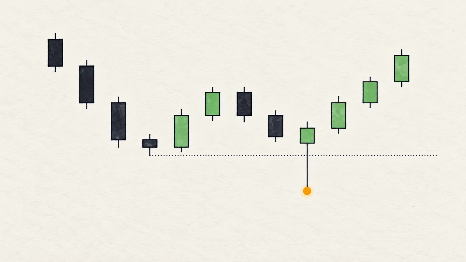
- Mark the swing points. A swing high is a candle with lower highs on both sides; a swing low is the mirror image. Skip the small wiggles. A common check is three candles on each side, which is also how Chart Radars defines a confirmed swing.
- Look for clusters. Find places where two or more swing points land close together. One isolated swing is only a swing. Two or three at nearly the same price is a level.
- Draw a band, not a line. Stretch the zone from the lowest to the highest point of the cluster, wicks included if they belong to the same cluster.
- Ask how far it is from price. A level far away from the current price is background. Keep the few levels you could realistically reach in the next several sessions.
- Write the reason. "Three 4H swing highs between 100 and 102" is a reason. If you cannot say why a line is there, delete it.
How do you measure a zone's width?
Use the market's own scale instead of a guess in percent. ATR (average true range: a candle's typical size) tells you how big a normal candle is right now. A reasonable approach is to treat swing points within about half an ATR of each other as one level. That keeps the same method working on a coin priced at 0.08 and one priced at 80000.
How do you count real tests of a level?
A "test" is a separate swing that reacted near the level, not every candle that happened to touch it. Count a test when:
- price approached the zone and then turned, creating a new swing high or low there, and
- there was meaningful distance and time between it and the previous test.
Ten candles grinding sideways against a line are one test, not ten. Counting swings keeps you honest.
More tests do not make a level stronger forever. Every test uses up some of the resting orders. A level touched many times often gives way eventually, because the buyers or sellers defending it have been absorbed. Read a high test count as "this is an important reference", not as "this will hold".
Why do fewer, better levels work better?
Three reasons.
First, you can act on them. Plans need clear if/then conditions: "If price closes above this zone, the next reference is that one." With fifteen lines nearly everything is "near a level", so the level tells you nothing.
Second, confluence is rare and useful. When a swing cluster also lines up with a prior-week low, a monthly open or an equal-highs pool, you have a reason that stands on more than one leg. See how the opens work as reference levels and equal highs and lows for two of the best partners.
Third, it protects you from hindsight. On a crowded chart you can always find a line that "worked". That is pattern matching on the past, not a method.
What happens when a level breaks? Role flip explained
When price closes decisively through a resistance zone, many traders treat that zone as potential support on the way back, and the reverse for a broken support. This is called a role flip. The logic is simple: traders who sold at resistance and were stopped out may buy back, and traders who bought the breakout have an entry near that zone.
Use it carefully:
- Look for a close beyond the zone, not just a wick. A wick through a level that closes back inside is a different event, covered in the liquidity sweep guide.
- A retest is a place to watch, not a place to act blindly. You still want a reaction, such as a rejection candle or a small structure shift on a lower timeframe.
- Flips fail often. A level that flips and then breaks again simply tells you the move had no support underneath.
How do you use levels in an if/then plan?
Levels are best used as conditions, never as predictions.
- Reaction plan: "If price reaches the demand zone, sweeps it and closes back above, the idea is alive. If it closes below the zone's lower edge, the idea is invalid."
- Breakout plan: "If a 4H candle closes above the zone, the next level is the target area. If price falls back inside, the break failed."
- Range plan: "In the middle between two levels there is no edge. Wait for an edge."
Notice what each plan includes: a condition, a next step and an invalidation. A line on a chart without those three things is decoration. The same logic sits behind market structure: levels tell you where, structure tells you what price is doing there.
What are the common traps?
- Drawing from the far left of the chart. Old swings far from price are not useful today.
- Anchoring to round numbers only. They attract attention, but a level needs actual swings behind it.
- Redrawing after the fact. If you move a line every time price pokes through, it can never be wrong, which also means it tells you nothing.
- Treating a wick as a break. Where the candle closes matters more than where it reached.
- Ignoring volatility. A zone 0.2 ATR wide in a quiet market and one 2 ATR wide in a violent market are different objects. Compare distances to ATR.
In Chart Radars: swing points are confirmed pivots with 3 candles on each side. Swing points within 0.6 ATR of each other count as one level (a cluster), and only levels up to 12 ATR from price are considered. A level's "tested N times" is the number of swings within 0.3 ATR of it. Near duplicates within 0.25 ATR merge and keep the best-known name, in this order: equal highs/lows, previous-week high/low, monthly open, weekly open, then previous day, daily open and plain swing cluster. The chart shows up to four levels on each side, as R1 to R4 above price and S1 to S4 below.
Honest note: a level is a place where something happened before, not a promise that it will happen again. Plenty of well-drawn levels break on the first clean test, and a high touch count can mean a level is close to giving way. Use levels to decide where you wait and where you are wrong, not to predict a bounce.
What does it look like on a real chart?
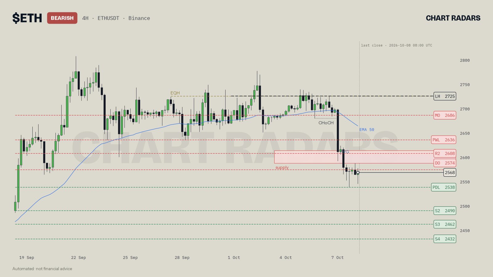
Look at ETH 4H, close of 8 Oct 2026. Several levels sit below price: the prior-day low (PDL) at 2538, then S2, S3 and S4 at 2490, 2462 and 2432. Above price there is a supply zone near 2587 to 2614 combined with a fair value gap, and the LH at 2725 drawn as the dashed protective swing. In the bot's read, the 2538 prior-day low is listed as tested 9 times, while 2462 and 2432 are each listed as tested 3 times. A handful of lines carry the whole story, and each has a name that says why it is there.
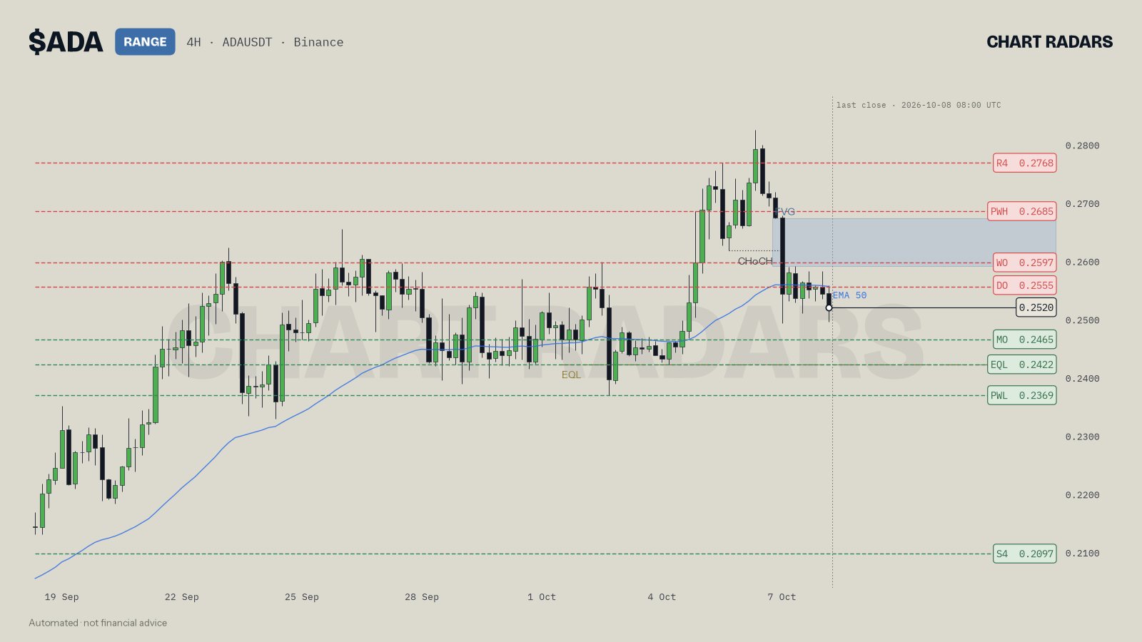
ADA 4H, close of 8 Oct 2026, shows the same idea with names. Price sits around 0.2520 inside a range, with the monthly open (MO) at 0.2465, equal lows (EQL) at 0.2422 and the prior-week low (PWL) at 0.2369 below it. The farthest level, S4 at 0.2097, is listed as tested 5 times. What matters for you as a reader is the order: each level is an obstacle or a reference on the way, and the read describes what would come next if the nearest one is closed through.
Key takeaways
- A level is a zone built from two or more swing points at nearly the same price.
- Measure zone width and distance in ATR so the method works on any coin.
- Count separate swings as tests, not candles that touched.
- Keep a few levels near price, each with a reason you can state.
- Use levels as conditions: if this closes through, then that is next, and here is where the idea is wrong.
Frequently asked questions
How do you draw support and resistance on a crypto chart?
Mark the swing highs and swing lows, find where several of them cluster at nearly the same price, and draw a zone around that cluster instead of a single line. Keep only the few zones close to the current price.
How many times does a level need to be tested to count?
There is no magic number. Two or three separate swing points at nearly the same price make a level worth watching, and more touches mean more orders were left there, not that it is stronger forever.
Is support and resistance a line or a zone?
A zone. Wicks, spreads and different participants mean price rarely reverses at one exact number, so a band about half a candle tall is a more honest way to draw it.
Why does broken resistance become support?
A broken level is where many traders were positioned on the wrong side or took profit. When price returns, those orders and memories often make it a reference again, but it is a tendency, not a rule.
Do support and resistance levels work on every timeframe?
They exist on every timeframe, but a level built from daily swings carries more history than one from 15-minute swings. Higher timeframe levels usually matter more when they overlap.