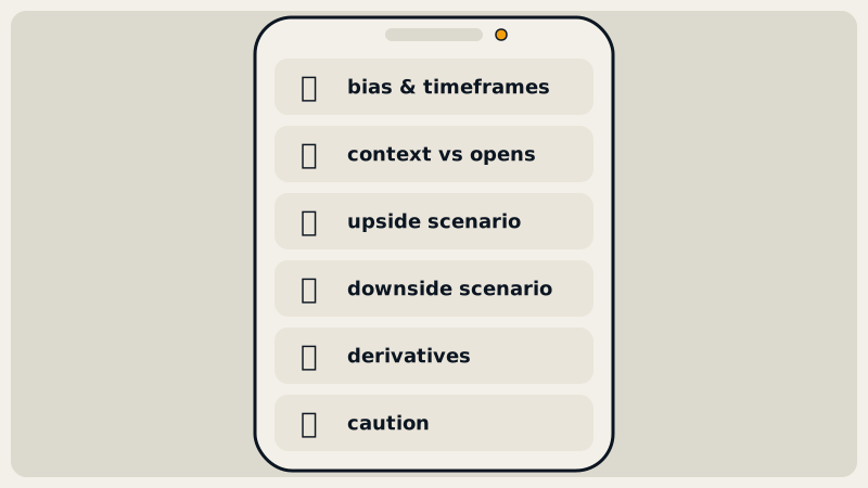
A Chart Radars read is a chart image plus a structured text analysis, produced for any coin you send to the Telegram bot @chartradarsbot. The text always follows the same order: bias across timeframes, price against key opens, a plan zone or range edges, an upside and a downside scenario, derivatives data and a caution note. This guide explains each line and each chart marker.
What do you get when you send a coin?
Type a ticker such as SUI, LINK 1h or ETH 1d and three things come back:
- A chart. The bot's own image, drawn from closed candles only, with levels, zones and labels already on it.
- A short post. Two lines: the coin, timeframe and price, then
Bias: ... · full read below. It is the headline and nothing more. - The full read. The long message, written in English, Spanish or Brazilian Portuguese, that this guide walks through.
Everything is built from Binance spot candles that have already closed, plus futures data (funding, open interest, taker volume, long/short ratio). Live reads contain no AI improvisation: rules produce the numbers and approved templates turn them into sentences. That is why two coins read on the same day are comparable line by line.
If you want the method behind the reading order, start with how to read a crypto chart. This page is about the output.
The read, line by line
Each line starts with an emoji so you can scan it. Here is the order, with a real read quoted further down.
🌌 Header. Coin, timeframe, last closed price: Chart Radars read · $SOL · 4H · 115.0. The price is the close of the latest finished candle, not a live tick. The chart marks that candle with a dashed vertical line and a "last close" label showing when that candle closed (UTC).
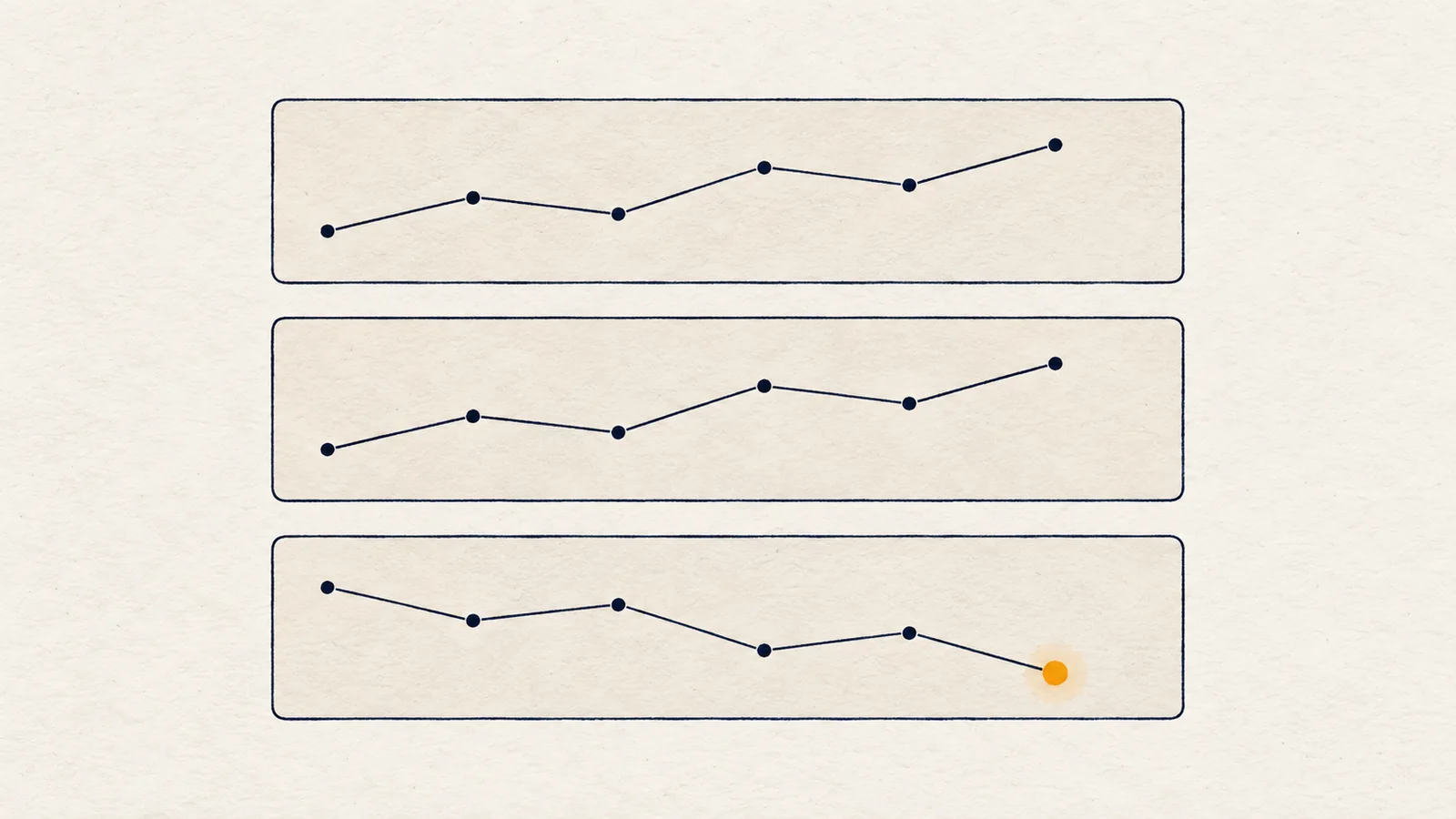
🧭 Bias and timeframes. The direction the read leans, and why. Bias is bearish, bullish or neutral. It leans one way only when more timeframes support it than oppose it and the chart you asked for is not on the other side. Otherwise it says neutral, and that is a legitimate answer. Each timeframe's trend combines structure with the 50 EMA; see market structure and multi-timeframe analysis.
📍 Context against the opens. Where price sits relative to the monthly, weekly and daily open: below all three, above all three, or between them. These are reference prices many traders watch, covered in weekly, daily and monthly opens.
⚠️ Caveats. Appears when something disagrees with the bias: a higher timeframe on the other side, an RSI divergence, or a coin lagging Bitcoin at its highs. This is the line that keeps a read honest. A divergence means momentum weakened; it does not mean a reversal.
Zone or range edges. When there is a clear lean, the read names a preferred zone (🎯): the area a pullback would reach, built from an open gap and/or the nearest level and labelled demand or supply. If price sits in the middle of a range, you get ↔️ instead: only the edges deserve attention, and the middle is "no edge".
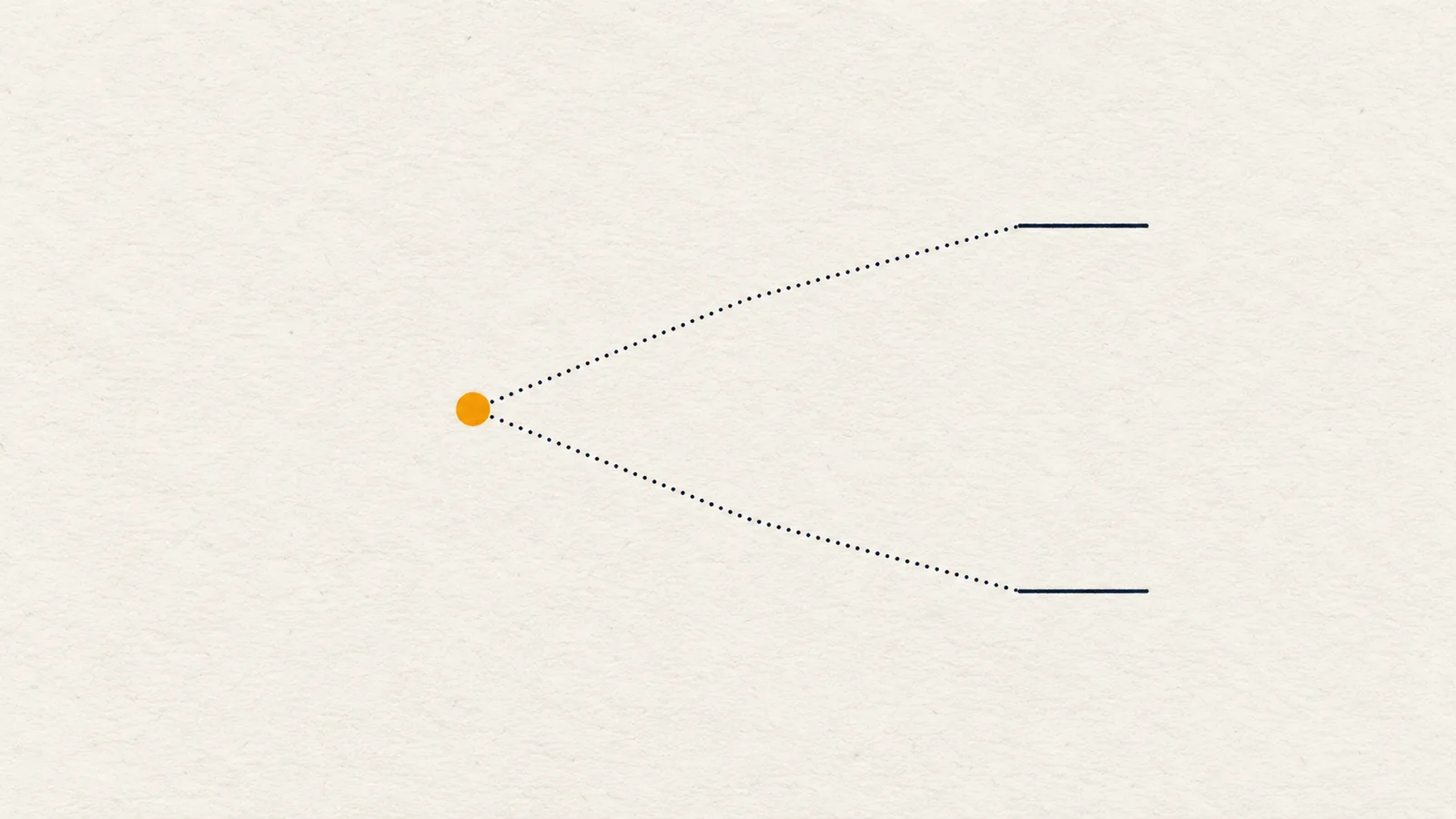
📈 / 📉 Scenarios. Two conditional paths: "a 4H close above X opens the way to Y, then Z." Trigger levels are closes, never wicks, and each path lists at most four steps. The read adds a volume remark (🔊): whether the last candle's volume is in line with the previous 20, and who has carried volume lately. A break wants volume to expand, and the read says so. The logic is the one in trading scenarios and invalidation.
✅ Levels and ❌ invalidation. The ✅ line lists the levels along the path where the plan reduces exposure; read it as a map of levels, not an instruction. The ❌ line is the one to read twice: the key swing, the nearest swing that carries the direction. A close beyond it cancels the read. It sits at least 1 ATR and at most 6 ATR from the entry.
📊 Derivatives. Open interest and its 24-hour change, funding, taker buy/sell ratio and long/short ratio. See funding rate and open interest for how to interpret them.
💡 Caution. One sentence of discipline, usually "let price come to the zone and enter only on confirmation". It repeats a rule, not a forecast.
Disclaimer. Automated · not investment advice. The read is analysis, not advice.
What do the chart markers mean?
The chart uses a beige background, green and black candles and a blue 50 EMA line. On the right you will find:
- Red boxes: levels above price, labelled R1 to R4, or by name when the level is a known one.
- Green boxes: levels below price, labelled S1 to S4 or by name.
- WO, DO, MO: weekly, daily and monthly open. PDH, PDL, PWH, PWL: previous day's and previous week's high and low. See previous day and week highs and lows.
- Black box with the price: the last close. A dotted vertical line marks the last closed candle.
- Black dashed line: the key swing, the level the whole read rests on (a higher low in an uptrend, a lower high in a downtrend), with its own label such as
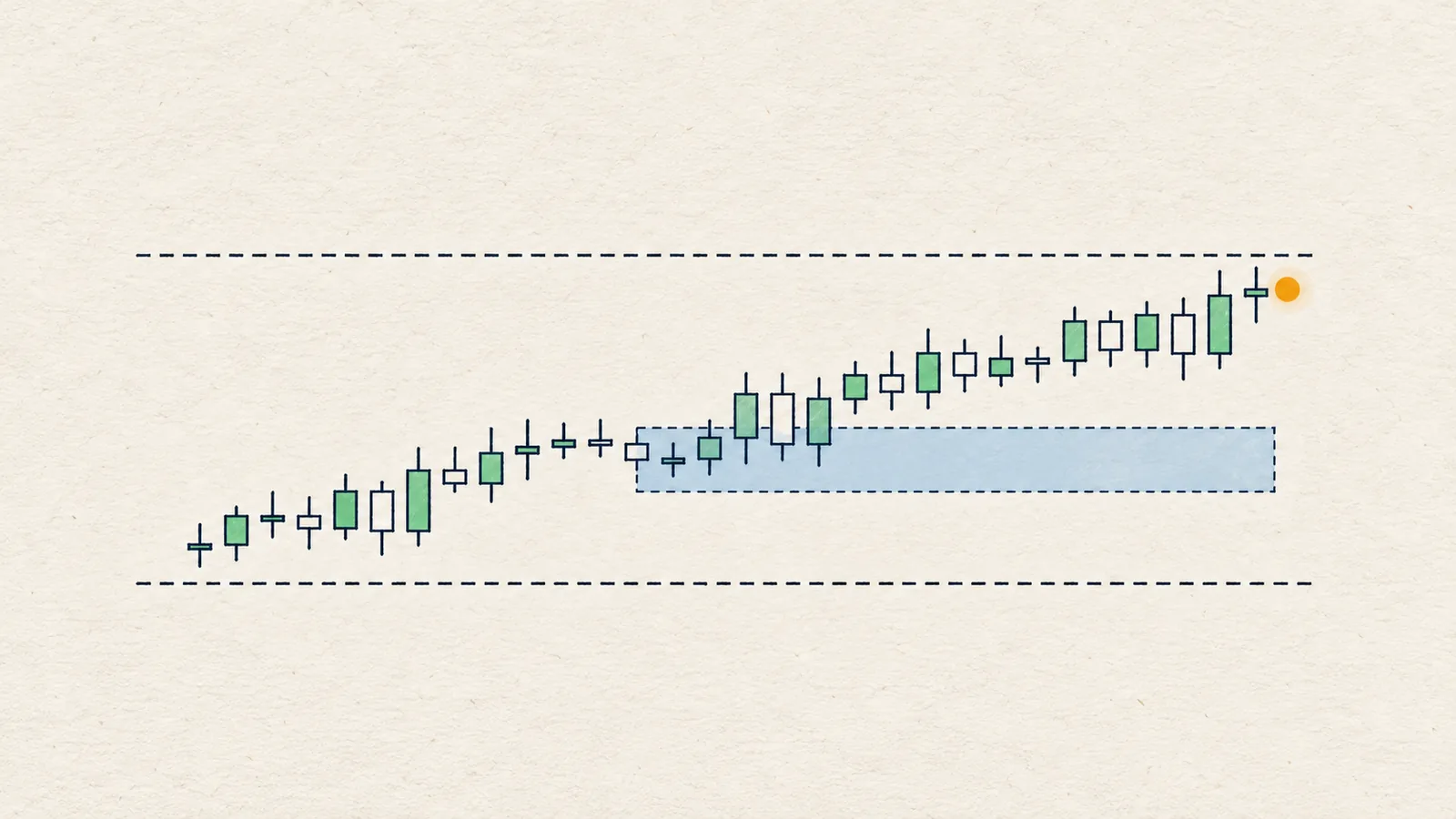
LH 122.0. - Blue shaded box: a fair value gap, the three-candle gap price moved through quickly.
- Orange arrow and "sweep": a liquidity sweep, a wick beyond a recent swing that closed back inside.
- CHoCH or BOS label: the most recent structure break. BOS continues the old direction; CHoCH goes against it.
- "demand" or "supply" box: the zone the read refers to, green for demand and red for supply.
- Top left: the coin, a bias chip (BULLISH, BEARISH, or RANGE when the bias is neutral) and the timeframe. Top right: the brand and a faint watermark.
Swing points that sit close together merge into one box, so a box can stand for several touches; the read tells you how many times a level was tested. For how levels form, see support and resistance.
Walkthrough: SOL 4H, close of 8 Oct 2026
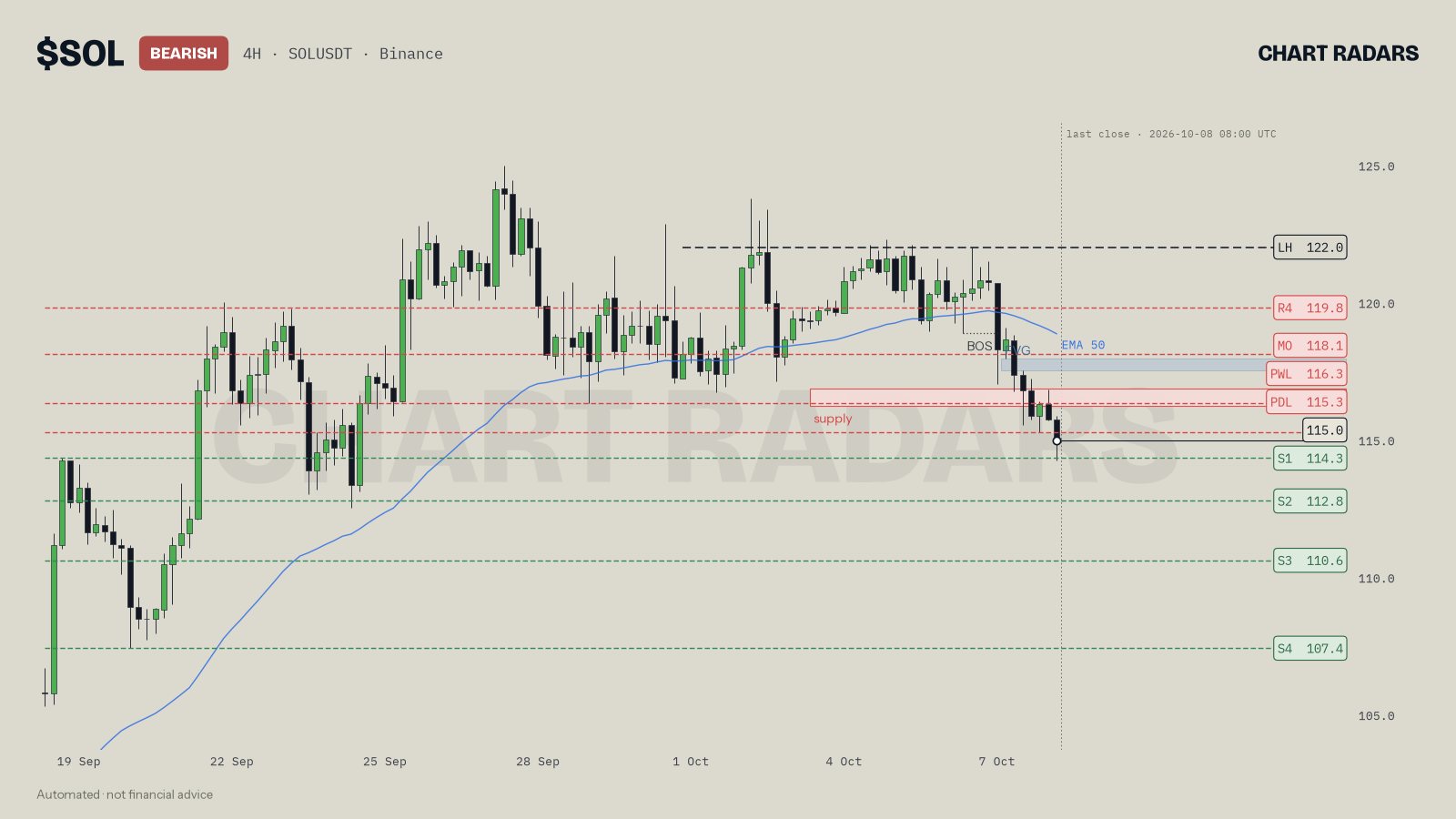
The chip says BEARISH. Price (115.0) sits under the red PDL and PWL boxes and under the monthly open (MO 118.1), and the black dashed line at 122.0 is labelled LH. The pale blue box is a bearish FVG; the red box marked "supply" is the zone. Now the text, quoted from the bot:
🧭 My read on $SOL is bearish, mostly because the weight of structure on 4H and 1D is bearish, and only 1W is on the other side, and price is still pinned below the last lower high at 122.0.
Bias bearish: two timeframes for, one against. The 122.0 returns later as the invalidation.
📍 It is also below the monthly open at 118.1, weekly open at 121.6 and daily open at 116.3, so the bigger picture backs the idea.
All three opens sit above price.
⚠️ However, there is a bullish RSI divergence on 4H: price went lower but momentum did not. On top of that, the 1W structure disagrees, still bullish. That makes me more selective with shorts and keeps my size smaller.
Two reasons for caution, both stated. The bias is not allowed to look cleaner than the chart.
📉 Price is already leaning on the 114.3 swing low, which means the breakout scenario is the first one to play out. If bears push and hold a 4H close below 114.3, I expect a slide toward the 112.8 swing low, next the 110.6 swing low, next the 107.4 level tested 3 times at the end of the run.
The trigger is a 4H close below 114.3 (S1 on the chart), then S2, S3 and S4.
🎯 My preferred short zone is 116.2–116.8 (supply), where a quick wick above the recent highs is fine so long as 122.0 holds.
That is the red box, a pullback area. Then the line to read twice:
❌ The level that cancels this read is 122.0: a 4H close over it means the bearish structure has failed.
The rest follows: volume at 1.6× average with sellers dominant, open interest down 1.6% in 24 hours ("positions are being closed more than opened"), and the 💡 line, "I would not chase this move".
Walkthrough: TAO 1D, close of 8 Oct 2026
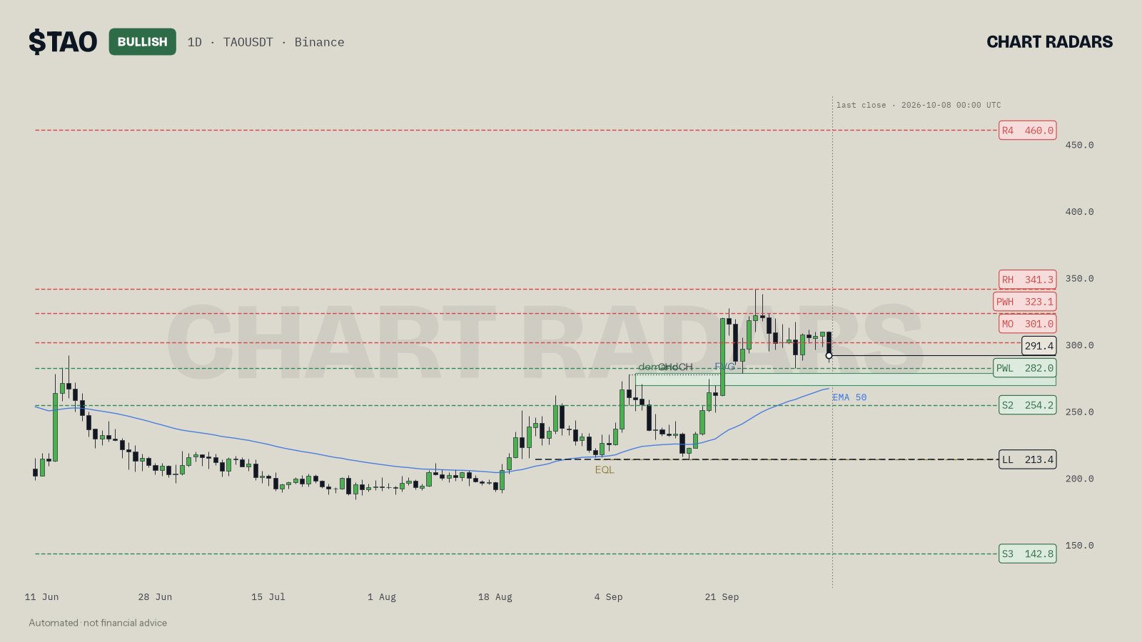
A bullish read, mirrored. The dashed line at 213.4 (labelled LL) is the key swing, the green box between 268.8 and 278.1 is a demand zone overlapping a bullish FVG, and a CHoCH label marks the last structure break. The text puts the pieces together:
📈 Price is pressing right against the 301.0 monthly open (tested 3 times), so the breakout path comes before any pullback. A 1D close above 301.0 would open the way up: the 323.1 prior-week high, next the 341.3 range high, next the 460.0 swing high at the end of the run.
🎯 I would rather buy the dip in 268.8–278.1 (demand + FVG), and a liquidity sweep below the local lows is acceptable provided 213.4 is not violated.
The plan expects that a sweep may happen inside the zone. A wick under local lows cancels nothing; only a daily close under 213.4 does. The ⚠️ line on this read flagged a bearish RSI divergence on 1D and TAO lagging Bitcoin at its highs, so the bullish bias comes with its objections attached.
Timeframe buttons, refresh and the radar
Under a read there are 1H, 4H and 1D buttons, plus a refresh button. The timeframe you pick decides how much context is read: a 1H read looks at 1H, 4H, 1D and 1W together, a 4H read at 4H, 1D and 1W, and a 1D read at 1D and 1W. On 1H and 4H reads a 15-minute chart is checked for one thing: whether structure broke on the lower timeframe in the last four hours while price touched the zone. The daily read skips it, because it is mostly noise there.
The optional radar works differently. At each 4H close it scans the 20 most traded coins and sends a read only when something happened, in this priority: a liquidity sweep, then a structure break, then price at a key level. There are at most three reads per candle and one per coin per day. The scenarios in each radar read are followed for 72 hours, and the follow-up arrives as a reply to the same message.
/scorecard shows how past reads were scored. Every read is stored and checked after 24 and 72 hours.
In Chart Radars: a swing point needs 3 lower (or higher) candles on each side. The chip at the top left is the overall bias: BULLISH or BEARISH only when more timeframes lean that way than the other and the chart you opened is not against it, otherwise RANGE. Separately, the trend read needs structure, a close at least 0.3 ATR from the 50 EMA, and an EMA slope in the same direction over the last 10 candles; otherwise it says range. Levels within 0.6 ATR merge. Funding above 0.03% means longs clearly pay; below -0.01% means shorts pay. Open interest moves under 1% count as stable. The key swing is 1 to 6 ATR away.
Honest note: a read is a map of conditions, not a prediction. In our own historical testing, the trend label alone did not show a strong directional edge, and that is the reason a read lists both directions, any caution it finds and, when it leans, an invalidation. Use it to decide what you are waiting for, then check the chart yourself.
Key takeaways
- You get a chart, a short post and a full read, all from closed candles and fixed rules.
- Read the lines in order: bias, opens, caveats, zone, scenarios, invalidation, derivatives.
- The dashed key swing on the chart and the ❌ line in the text are the same level: the one that would cancel the idea.
- Red boxes are levels above price and green boxes are levels below; names such as PDH or WO tell you which known level it is.
- Neutral, a range and "wait for the edges" are real answers, not failures of the tool.
Frequently asked questions
What does a Chart Radars read include?
Three things arrive together: a chart image, a short post with the coin, timeframe, price and bias, and a full read. The full read runs in a fixed order: bias and timeframes, price against the opens, a zone or range edges, an upside and a downside scenario, derivatives, and a caution note.
Is a Chart Radars read a prediction?
No. It is a map of conditions: where price sits, which levels matter and which close would cancel the idea. In our own historical testing the trend label alone did not show a strong directional edge, which is why the read lays out conditions in both directions and, when it leans one way, an invalidation level.
What do the coloured boxes on the Chart Radars chart mean?
Red boxes on the right are levels above price and green boxes are levels below. They are labelled R1 to R4 or S1 to S4, or by name when the level is a known one such as WO, DO, MO, PDH, PDL, PWH or PWL. The black box is the last close.
Which timeframes can I choose?
The bot offers 1H, 4H and 1D buttons. A read also looks at higher timeframes for context: 1H, 4H, 1D and 1W together on the 1H chart; 4H, 1D and 1W on the 4H chart; and 1D with 1W on the daily chart.
Does Chart Radars place trades or ask for my keys?
No. It sends text and a chart only. It does not trade and never asks for an exchange API key, a password or money.