The 50 EMA, or 50-period exponential moving average, is a line on the chart that follows the average closing price of roughly the last 50 candles, with extra weight on the most recent ones. Traders use it as a trend filter: price clearly above a rising line suggests an uptrend, and price clearly below a falling line suggests a downtrend.
The word to hold on to is filter. The 50 EMA is not a level where price must bounce, and it is not a forecast. It is a quick, objective way to say whether the market has been trending or just wandering. This guide covers how it is built, the two things to check (distance and slope), why a flat EMA with price on it means range, and the common ways people misuse it.
What is an exponential moving average?
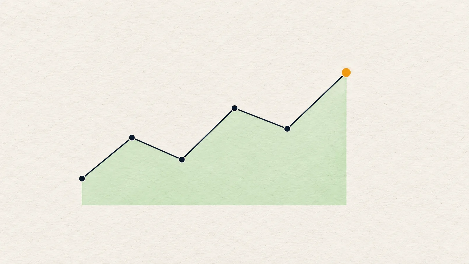
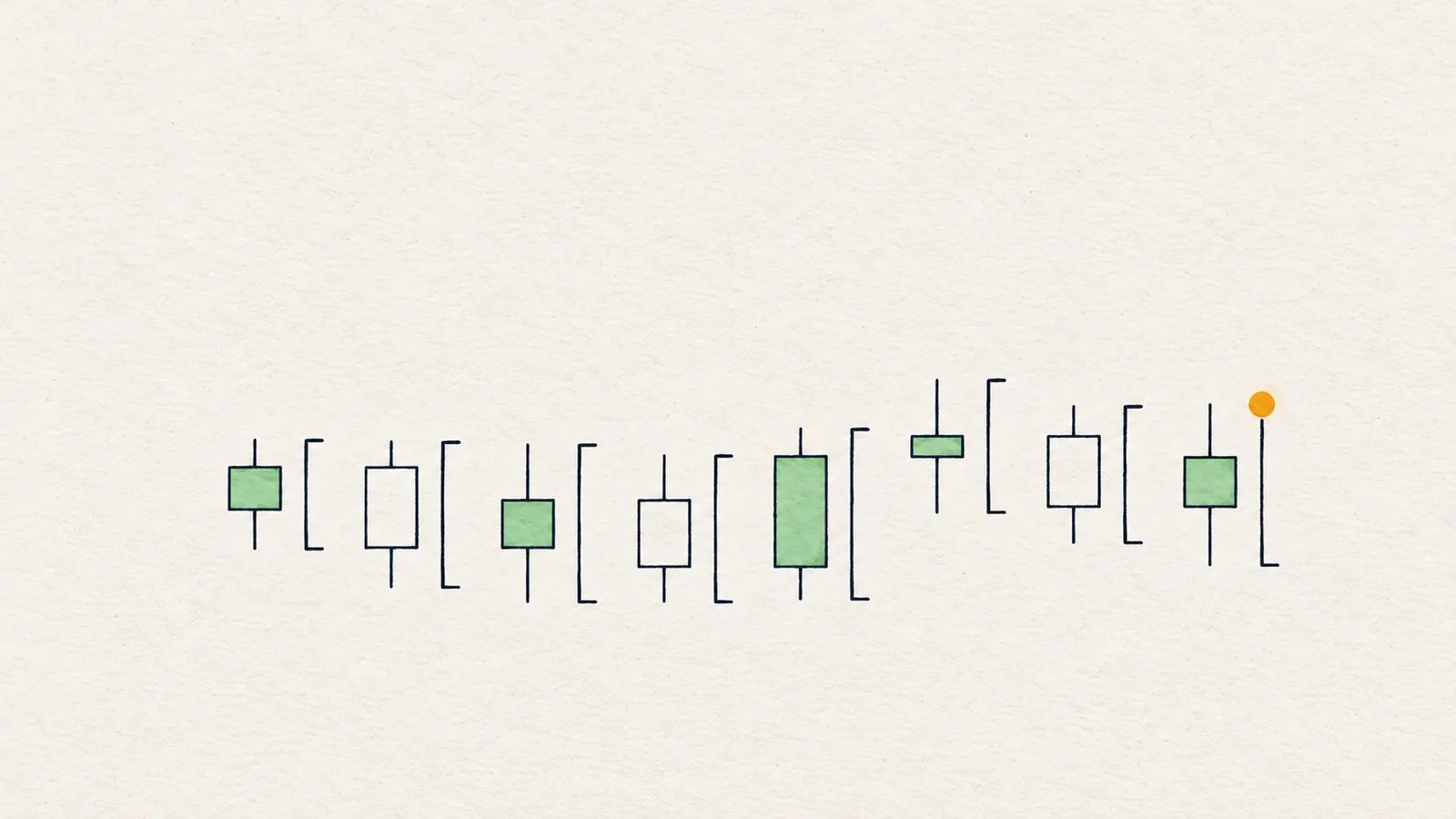
A moving average smooths price by averaging recent closes. A simple moving average (SMA) gives every candle in the window the same weight. An exponential moving average gives recent candles more weight, with older ones fading smoothly.
The effect is practical: an EMA turns slightly sooner than an SMA of the same length. On a 4H chart, 50 candles is about eight days; on a 1D chart, about seven weeks. The number 50 is a convention, not a law. It is popular enough that many traders watch it, and that shared attention is a large part of why it matters at all.
How do you use the 50 EMA as a trend filter?
Two checks, and both must say the same thing:
- Distance. Is the close clearly on one side of the line? Price one tick above the EMA says nothing. Price sitting a meaningful distance above it says buyers have held control for a while.
- Slope. Is the line itself pointing up, down or sideways? An EMA that is rising says the average has been climbing; one that is falling says the opposite; a flat one says nothing has been decided.
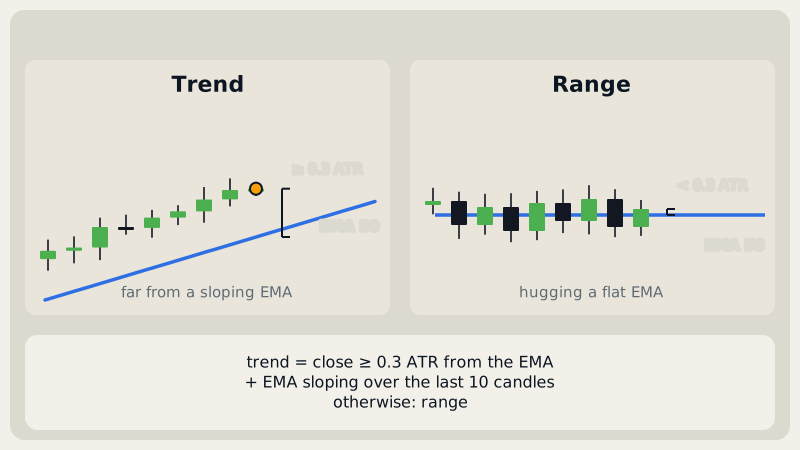
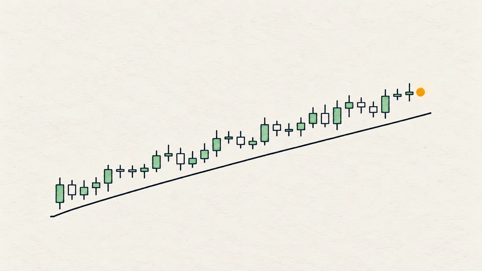
Then combine them. Price far above a rising EMA is the cleanest bullish picture. Price far below a falling EMA is the cleanest bearish one. Anything else is a reason for caution.
What if price sits on a flat EMA?
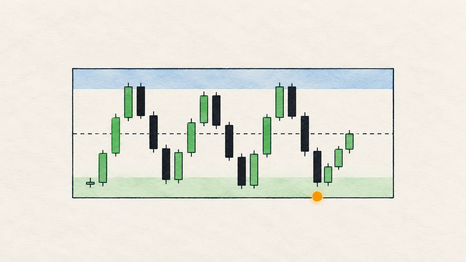
This is the most useful case to learn. When the EMA is flat and candles cross it again and again, the average has stopped moving because price has stopped going anywhere. That is a range, even if it does not look like a neat box.
In a range, trend-following logic misleads. "Price is above the 50 EMA, so buy" fires, then fails, then reverses, over and over. A better plan is to give up on direction, mark the edges of the range, and treat the middle as no-man's-land. See range trading for how to read that situation.
How far should price be from the EMA?
There is no sacred number, but there should be a rule, and it should be relative to normal candle size rather than to percent. A coin that moves 5% on a quiet day is a different case from one that moves 0.5%. Measuring the gap in ATR (see ATR indicator) keeps the rule the same on every coin: price is clear of the EMA if the gap is a meaningful fraction of a typical candle, and tangled if the gap is smaller than that.
Is the EMA support or resistance?
Sometimes price pulls back to the EMA and turns, and the chart looks perfect afterwards. Sometimes it slices straight through. Neither is certain, because nothing forces price to respect a line that is a mathematical average.
What the EMA does offer is a reference: in a healthy uptrend, pullbacks that stay above a rising 50 EMA say the trend is intact; a close that cuts through and stays under it says the trend is weakening. That is information about the trend's health, not about where to buy.
If you want a level, use swing points and structure, which show where orders actually sat. See market structure.
How should you read the EMA across timeframes?
The same line says different things on different charts. A 50 EMA on the daily chart describes the trend of weeks; on 4H, of days. The usual practice is to use the higher timeframe to set direction and the lower one to time entries. If 1D price is above a rising EMA and 4H is below a falling one, you are looking at a pullback within a larger uptrend or the start of a larger turn, and the answer depends on structure. That is the question multi-timeframe analysis is built around.
What is a sensible way to put it into a routine?
A short routine keeps the EMA in its place. First, on the higher timeframe, note whether price is clear of the line and whether it slopes. Second, on your trading timeframe, do the same. Third, read the structure: are the swings making higher highs and higher lows, or the reverse? Only when all three agree do you have a trend you can plan around; when two agree and one does not, call it mixed and say so in your notes. Finally, write the condition that would end the idea, such as a close beyond the protective swing. The EMA contributes two of the inputs, and the rest of the work is still structure and levels.
When does the 50 EMA mislead?
- It lags. An average of the past always turns after price does. By the time it flips, a good part of the move has happened.
- Crossings are noise in a range. Price crossing a flat EMA means little.
- It is not a level. Buying every touch of the EMA works for a while in a strong trend and fails when the trend ends.
- It ignores structure. Price can sit above a rising EMA while making lower highs. The EMA says "uptrend", structure says "weakening". Structure usually deserves the vote.
Honest note: The 50 EMA is a descriptive tool. It tells you what the trend has been, not what it will be, and the idea that price "respects" it is often a story told after the fact. Treat a touch of the line as a place to look at structure, not as a reason to enter.
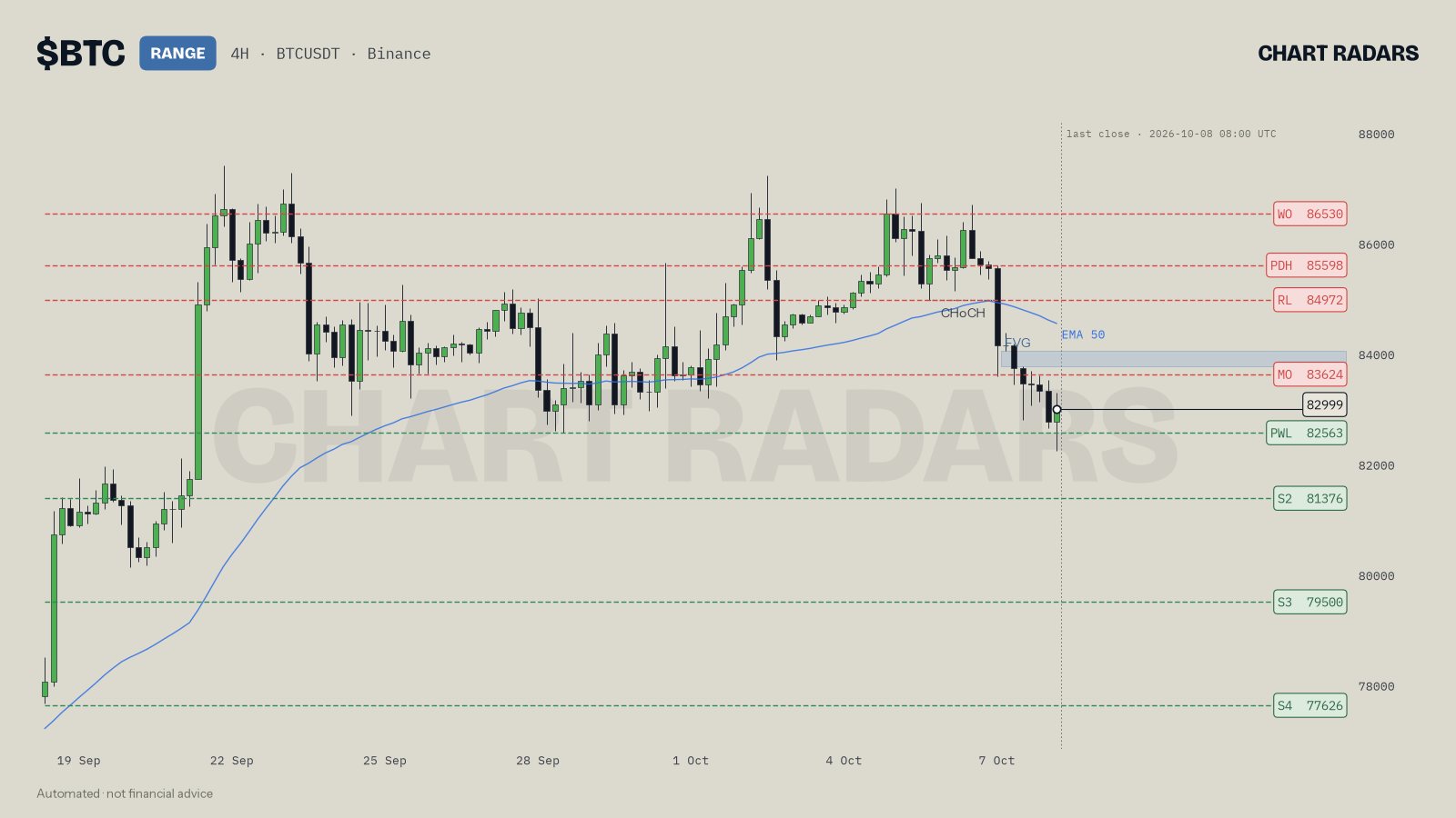
On BTC 4H, close of 8 Oct 2026, the chart carries a RANGE label even though price (82999) sits under the blue EMA 50 line, and the line has begun to turn down. The chart label is the overall bias, and the read is neutral because the timeframes pull apart (4H bearish, 1D bullish, 1W bullish). The 4H structure is also mixed, with a lower high and a higher low, so the three-condition trend read would say range on its own. Price below a turning EMA is one input; it did not settle anything alone. That is the filter working as intended: it declined to call a trend on one condition.
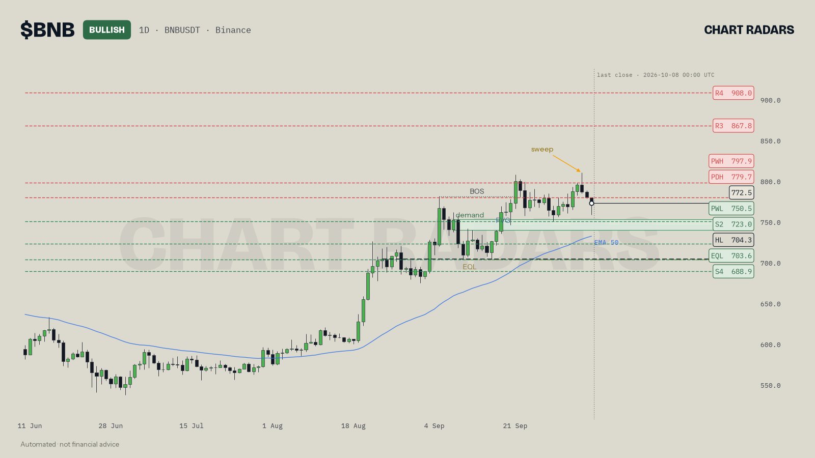
On BNB 1D, close of 8 Oct 2026, the picture is the opposite. The chart label is BULLISH, the structure is a higher high with a higher low, and price sits above the rising EMA 50 line, so the trend read is bullish too. The read mentions a caution as well, that BNB made higher highs against USDT but not against BTC. Even with all three trend conditions in place, the read stays selective rather than treating the label as a green light.
In Chart Radars: the trend read needs three things at once: structure (HH plus HL for bullish, LH plus LL for bearish), a close at least 0.3 ATR from the 50 EMA, and an EMA slope over the last 10 candles pointing the same way. If one fails, it says range. The label in the chart header is the overall bias across timeframes, and RANGE there means neutral. The per-timeframe trends in the full read are looser: if price is within 0.3 ATR of the EMA the timeframe counts as flat, otherwise it follows structure and the side of the EMA. That is why a chart can be labelled RANGE while the read lists 4H as bearish.
Key takeaways
- The 50 EMA is a filter for trend, built from recent closes with extra weight on the latest.
- Check two things: how far price is from the line, and which way the line slopes. Both must agree.
- Price tangled around a flat EMA means range. Do not apply trend rules there.
- The EMA is not support or resistance by magic. Use swing levels for levels.
- It lags. Structure and higher timeframes should overrule a lone EMA reading.
Frequently asked questions
What does the 50 EMA tell you?
It shows the average closing price over roughly the last 50 candles, weighted toward the most recent ones. Price above a rising 50 EMA suggests an uptrend; price below a falling one suggests a downtrend. It describes the past trend, it does not predict the next move.
Is the 50 EMA good for finding support and resistance?
Sometimes price pauses near it, because many traders watch it. But there is no force that makes it hold. Treat it as a reference line, and confirm with real swing levels and structure.
What does it mean when price is on a flat 50 EMA?
A flat EMA with price tangled around it means there is no clear trend. The market is balancing, which is a range. Trend rules work poorly there, and edges matter more than the middle.
What is the difference between EMA and SMA?
An SMA gives all candles in the window the same weight. An EMA gives more weight to recent candles, so it turns sooner. The line is a little more nervous and a little more current.
Which timeframe is best for the 50 EMA?
It works on any timeframe, but it means different things on each. A 50 EMA on 1D covers about seven weeks; on 4H about eight days. Use the higher timeframe to set direction and the lower one for timing.